A comprehensive guide to maintaining brand consistency across all touchpoints. This document defines the visual identity system for PBS — covering logo usage, color palette, typography, and digital design standards.
To deliver exceptional residential and commercial construction solutions with uncompromising quality, transparency, and innovation.
To be the most trusted name in building and construction — known for modern design, structural excellence, and lasting partnerships.
Integrity · Precision · Innovation · Reliability · Sustainability — the pillars that drive every project and decision at PBS.
The PBS logo is an architectural lettermark — the initials "P", "B", and "S" are designed to resemble a city skyline of interconnected buildings rising from a curved horizon. The curved horizon at the base represents the globe, symbolizing PBS's global vision and worldwide reach. Together, it conveys growth, construction, and structural ambition on a global scale.
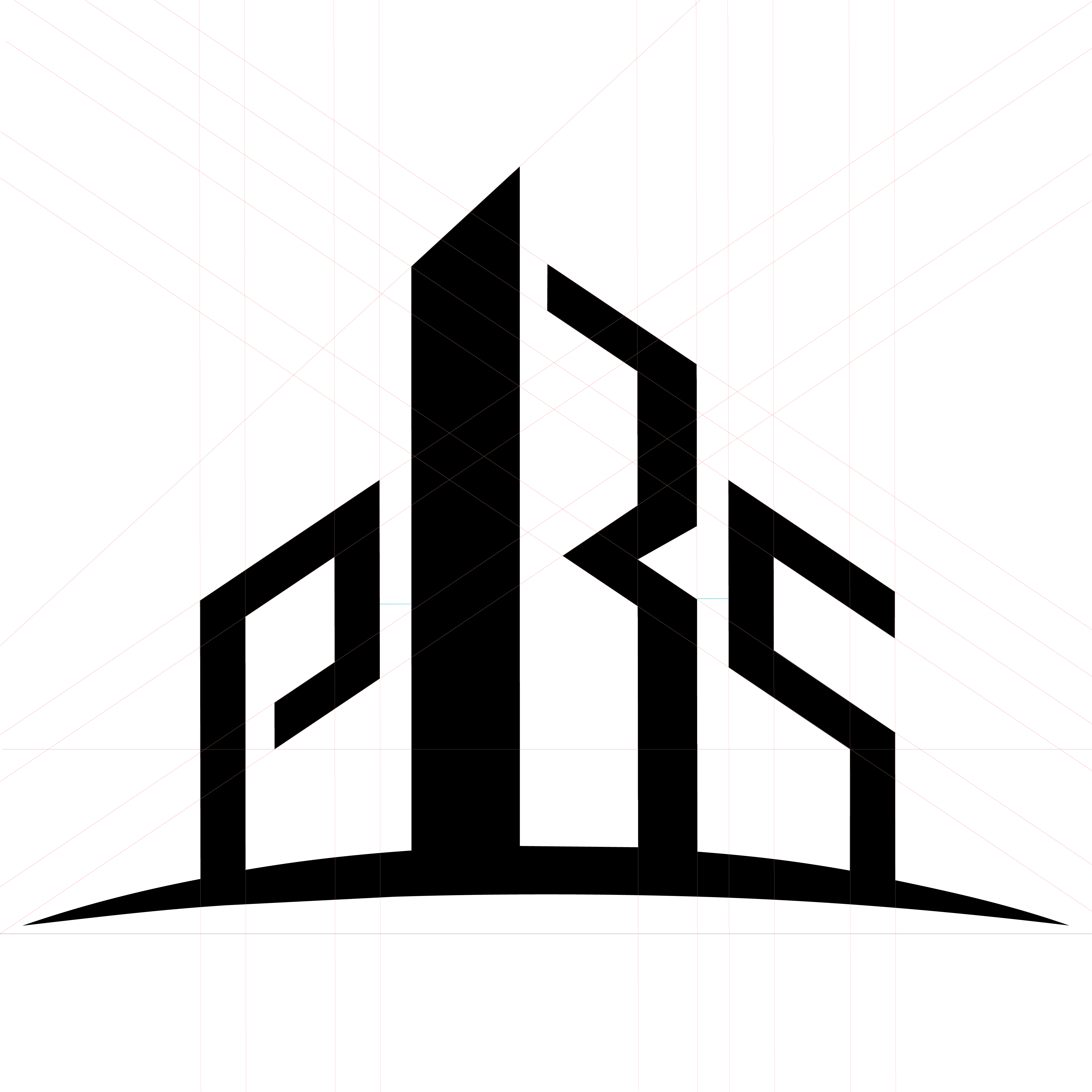
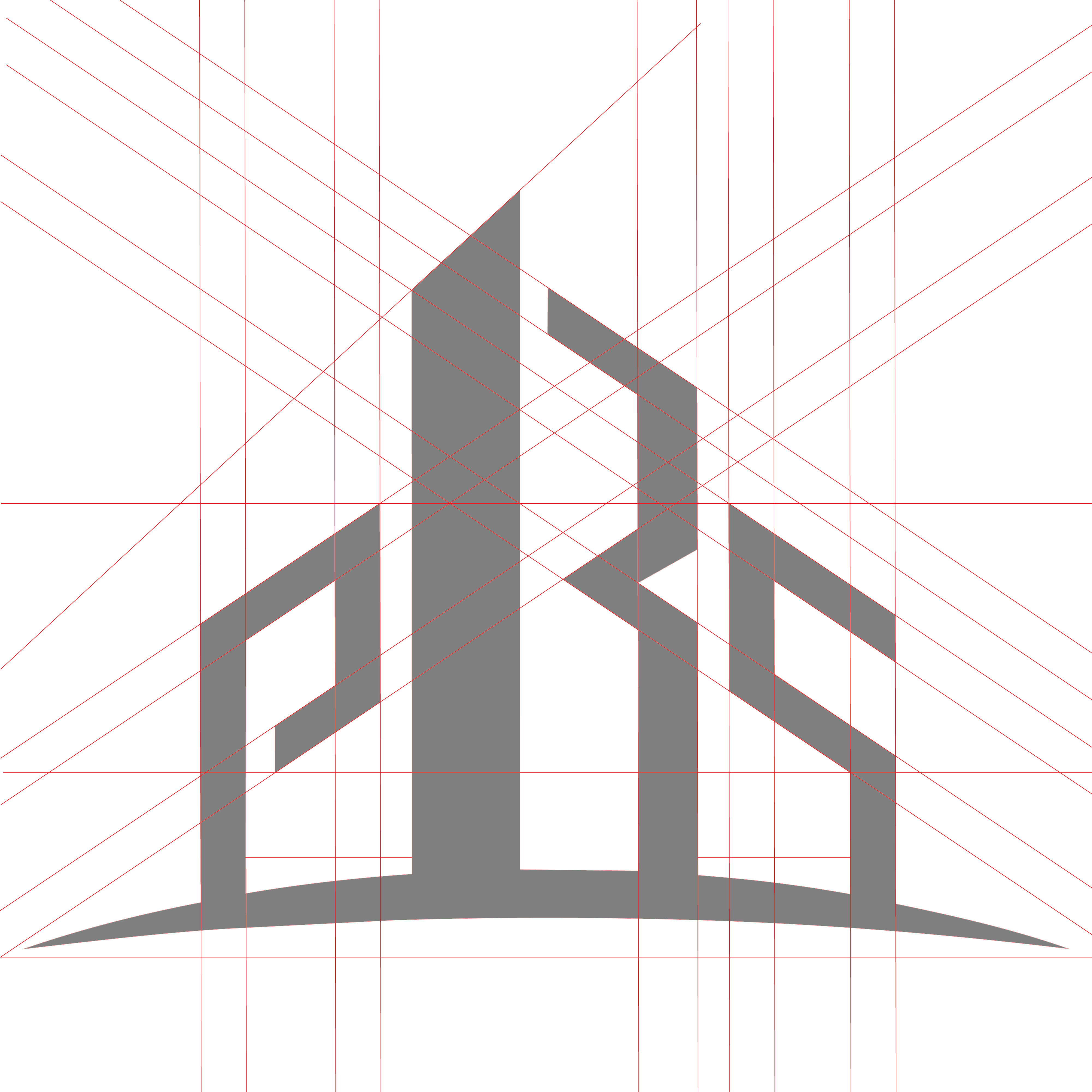
The logo was built on a precise geometric grid system. Every angle, proportion, and curve was carefully calculated to achieve structural harmony — reflecting the precision and craftsmanship that PBS brings to every project.
When the logo is used alongside the full company name, use these approved lockups only. The wordmark uses Montserrat Bold for "PUBLIC BUILDERS" and Montserrat Medium for "& SUPPLIERS".
The PBS color system is derived from the logo's architectural charcoal tone. The palette balances dark, structural tones with warm metallic accents — projecting strength, premium quality, and modern sophistication.
PBS uses a two-font system designed for clarity and architectural elegance. Montserrat — a geometric sans-serif — mirrors the angular, structured form of the logo. Inter provides exceptional readability for body text and UI elements.
Use for: Headlines, subheadings, navigation, buttons, logo wordmark, hero text, feature titles
Use for: Body text, paragraphs, descriptions, form fields, captions, metadata, UI labels
Font: Montserrat Bold, 700 weight
Tracking: 3px letter-spacing
Case: Always uppercase
Standards for implementing the PBS brand across websites, web apps, and digital platforms. These guidelines ensure a consistent, premium experience across all screen sizes.
:root {
/* ─── Brand Colors ─── */
--color-primary: #3C3C3E;
--color-primary-dark: #1A1A1C;
--color-primary-light: #5A5A5C;
/* ─── Accent ─── */
--color-accent: #C9A96E;
--color-accent-dark: #A68B4B;
--color-accent-light: #D4BC8A;
--color-cta: #2A9D8F;
--color-cta-hover: #238578;
/* ─── Neutrals ─── */
--color-text: #3C3C3E;
--color-text-secondary: #6B6B70;
--color-text-muted: #B0B0B5;
--color-border: #EDEDEF;
--color-surface: #FFFFFF;
--color-background: #F7F7F8;
/* ─── Semantic ─── */
--color-success: #2D8F5E;
--color-warning: #E8A838;
--color-error: #C4453A;
/* ─── Typography ─── */
--font-heading: 'Montserrat', sans-serif;
--font-body: 'Inter', sans-serif;
/* ─── Spacing Scale ─── */
--space-xs: 4px;
--space-sm: 8px;
--space-md: 16px;
--space-lg: 24px;
--space-xl: 32px;
--space-2xl: 48px;
--space-3xl: 64px;
--space-4xl: 96px;
/* ─── Border Radius ─── */
--radius-sm: 4px;
--radius-md: 8px;
--radius-lg: 12px;
--radius-xl: 16px;
/* ─── Shadows ─── */
--shadow-sm: 0 1px 3px rgba(26,26,28,0.06);
--shadow-md: 0 4px 12px rgba(26,26,28,0.08);
--shadow-lg: 0 8px 30px rgba(26,26,28,0.12);
--shadow-xl: 0 16px 50px rgba(26,26,28,0.16);
}
12-column grid with 24px gutters. Max content width: 1200px. Side padding: 24px (mobile) / 48px (tablet) / 64px (desktop).
White background, 12px border-radius, --shadow-md on rest, --shadow-lg on hover. 24px internal padding.
Buttons: 8px. Cards: 12px. Modals: 16px. Avoid fully rounded (pill) shapes — angular designs align better with the PBS brand.
Use an 8px base grid. Section spacing: 96px (desktop) / 64px (mobile). Component gaps: 24px. Inline spacing: 8–16px.